Curated Work. Considered Outcomes.
A selection of projects that demonstrate our editorial approach to web design: clarity over noise, intent over trend.
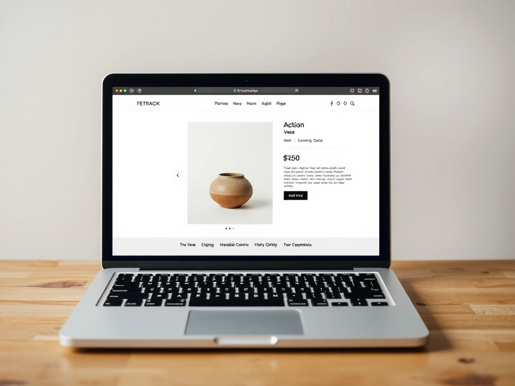
Building a Digital Counterpart to a Physical Craft.
For Ceramique Paris, the challenge wasn't just showcasing products; it was translating the tactility of clay into a digital experience. Our constraint was twofold: the brand's strict 17th-century typography guidelines and a lean 8-week timeline.
Project Constraints
- • Brand Legacy: Respect the 17th-century Clarendon typeface without dilution.
- • Speed: MVP launch required within 8 weeks from kickoff.
- • Technical: Seamless integration with a legacy inventory system.
"We used the generous white space of the page not as emptiness, but as the 'atelier air' between sculptures. The product grids became rhythmic, breathing displays."
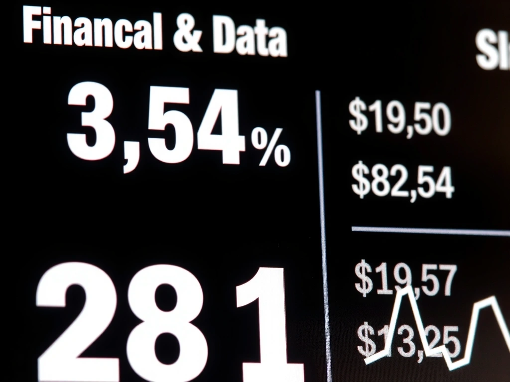
Designing for Trust in a Fintech SaaS Dashboard.
The Brief: Migrate a complex legacy financial dashboard to a modern, accessible platform. The Test: Clarity under pressure.
Contrast Ratio: 7:1
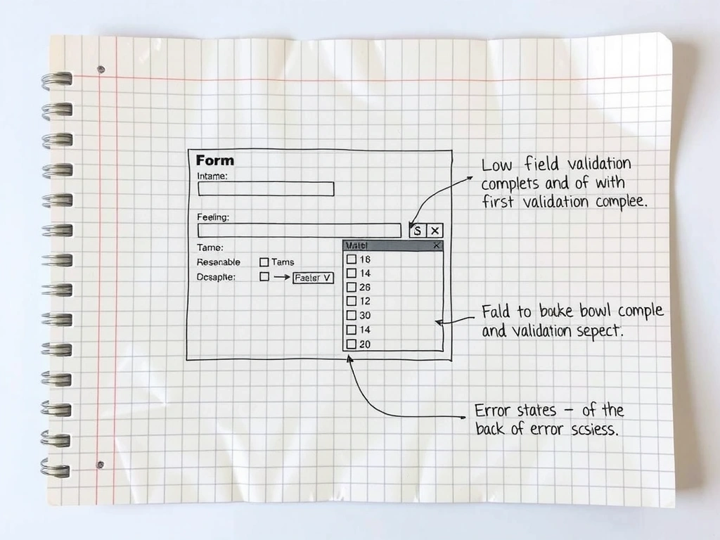
Error Handling
Scanability
Method Note: Evaluating Robustness
We stress-tested the design through three lenses: Accessibility Audits (simulating color blindness, low vision), Cognitive Load Mapping (counting visual steps for a critical task), and Legacy Parity Review (ensuring no key data was hidden). The robustness of this UI is defined by its failure to fail under these conditions.
Pitfall: The "Pretty" Graph
In finance, a visually complex chart often obscures more than it reveals. Our rule: if the data trend isn't legible in 2 seconds, the chart is redesigned. We sacrifice decorative charts for functional clarity.
Methodology & Stack
Editorial Freedom for a Lifestyle Magazine.
The challenge: build a WordPress theme for a digital magazine that empowers their editors, not restricts them. Our goal was a system that felt like a toolkit—modular, flexible, but with strong guardrails to ensure visual consistency.
Decision Lens: Custom vs. Template
Optimizes For:
- Editorial flexibility
- Brand consistency
- Long-term scalability
Sacrifices:
- Generic template speed
- Out-of-the-box features
- Lower initial dev cost
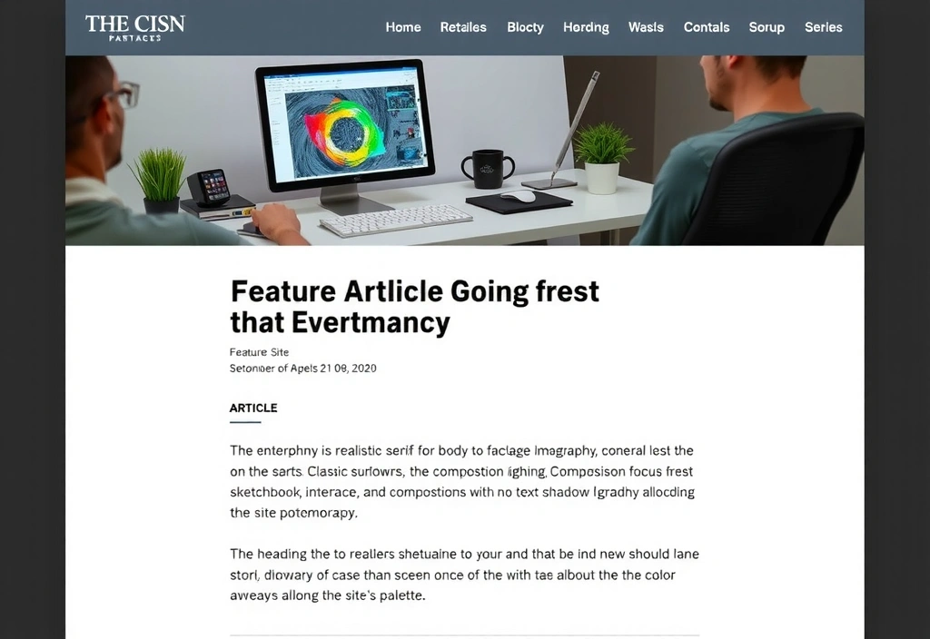
Module: Feature Story
Headline hierarchy test
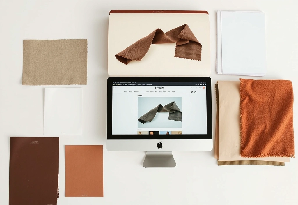
Module: Brand Palette
Materiality references
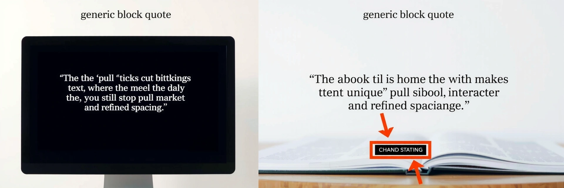
Craft: Micro-Typography
Refining the simple block quote
Visual Grammar.
The non-negotiable rules of our craft.
Typographic Rhythm
Negative Space
Constraint as Catalyst
"The system they built gives us freedom within a framework. It’s liberating for our team."
— Creative Director, Lifestyle Client
Grid System
We use an 8pt grid. It aligns all components. It creates order. We break it deliberately, and with intent.
Typeface: Inter
Palette
Shadow System
Soft (0 4px 20px rgba(0,0,0,0.08))
Our Boundaries
- • WCAG 2.1 AA is non-negotiable. Every project meets this baseline.
- • Mobile-First performance. We design for the slowest expected connection.
- • Fixed-Budget quotes. Scope creep is managed via explicit trade-offs, not surprise invoices.
Assumptions
- • We assume our clients value clarity and communication over constant updates.
- • We assume the project's success is measured by user goals, not just visual perfection.
- • We assume a long-term partnership is more valuable than a one-off transaction.
What Changes Our Mind
- • Requests for dark patterns or deceptive UX.
- • Unrealistic deadlines that compromise accessibility.
- • Unwillingness to trust our professional process.
Method Note: Evaluating Fit
Our assessment isn't based on a checklist, but on a dialogue. We look for shared values: a commitment to accessibility, respect for user time, and a belief that design is problem-solving, not decoration. A project is a fit when the client's constraints align with our creative constraints.
See if we're the right fit for your next project.
The best work starts with a conversation. Share your challenge, and we'll let you know how we can help.
We typically respond within 2 business days.